2013... front bumper, HUH?

This site may earn a commission from merchant affiliate
links, including eBay, Amazon, Skimlinks, and others.

Joined
Dec 26, 2009
Threads
46
Messages
860
Location
Bay Area, CA
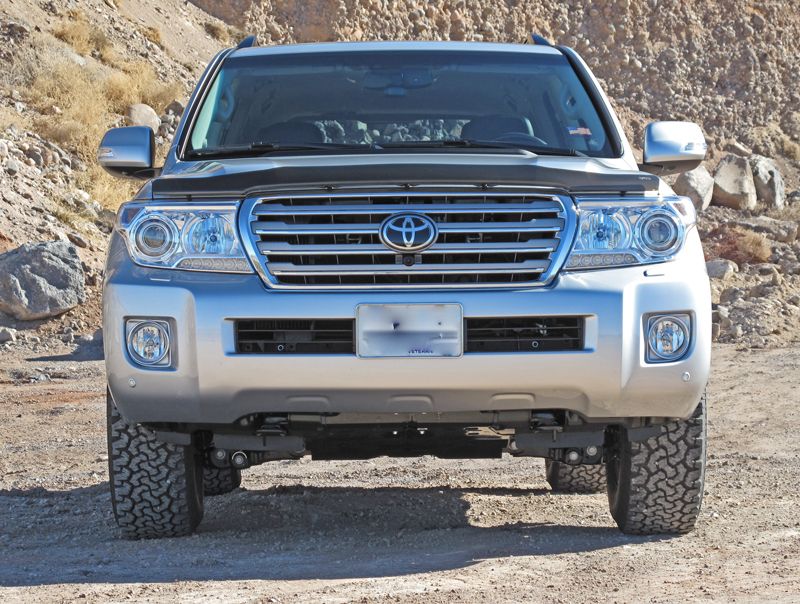
Ok, so I've been really excited about the 2013 updates on the 200. Loving the more updated interior, the front cam, glossy wood instead of matte finish (I'd really prefer no wood). Looks like they did a really nice job on the HVAC/Nav controls too... but what was Toyota thinking with the bumper update?

I mean it's hideous plain and simple. I don't enjoy the shape of the fog lights either and I think the piano finish on center stack wasn't brilliant (going to have a ton of finger prints and the few times a year it might be clean it'll probably be reflecting into your eye) but that's somewhat livable.

What isn't fathomable is the front bumper looks dimpled at each end. It really loooks like Toy tried to ruin one of the few good looking lines on the 200. The front end was gorgeous on the pre-face lift models.

Someone give me some perspective? Were they trying to reduce the chance for front bumper scrapping? Its ghastly. When the time comes I'm going to have to look away from the 2013's. What do others think. Is anyone else thinking of swapping to a pre '13 bumper style? I think the update to the instrument cluster/gauges makes the 2013 worth buying alone but the bumper is a huge miss for me.
 
Last edited:
2013 's ... :flush:

2013-Toyota-Land-Cruiser-5.webp


url-1.webp


url.webp
 
pre '13 ... :clap:

url-2.webp


url-3.webp


url-4.webp
 
It works for me :clap:

ToyotaLC200_1_21JAN13_zps684b1453.jpg


ToyotaLC200_2_19JAN13_zps219185e3.jpg


The pre-'13's look kind of ... stubby :whoops:
 
Definately changes the visual flow, and probably closely related to change in lights.

I think the square lines remind me of a Pilot or an H2, both likely done in an attempt to appear more masculine.
 
Definately changes the visual flow, and probably closely related to change in lights.

I think the square lines remind me of a Pilot or an H2, both likely done in an attempt to appear more masculine.


^ what he said. Honda Pilot-ish :bang: 
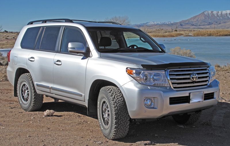
Plus the visual flow has always been of a masculine and blunt front end. Throughout the whole heritage it remains constant and then ... in 2013, Mr. T goes Honda on us. I've never confused a Honda Pilot as masculine.

I will say they nailed the interior updates. The new gauge cluster is pretty hot.


Has anyone seen the new 2013 with the arctic truck flares?
 
The '13 front looks more bold and a step away from looking Highlander-ish.
 
I'm personally not a fan of the 2013 refresh either. The more I see them, the less I like them and the more it makes me appreciate the '08-11's. To me, it's a case of change of the sake of change.

The headlights are too busy, the bumper is odd, the round fog lights in square housings don't make for a cohesive design (although I do understand that they are probably trying to match the HID lenses in the the headlight housing). And I dislike the chrome strip down the side.

I do like some of the additional features like the extra cameras, improved audio/climate/nav system, integrated turn signal lamps and air flow ridges in the side mirrors, and the "Land Cruiser" logo in the tail lamps. Other than that, I'll happily keep my 2009.
 
Hoser - did you really mean "bold"? Don't you think Toy just moved it in a different direction? Maybe it's less Highlander-ish but now it's more Honda Pilot-ish. I'd rather keep it in the family line and also I like keeping the LC genes which have always been big and wide making a blunt looking front end.


sptsdn, I agree with your comments about the interior. To me the extra cameras (one is even for spotting while 4x4ing? genius!) and also the updated gauge cluster and HVAC/radio/nav controls are the real winners of the 2013 refresh. How do you like the gauge cluster on the '08-'11? I'm really against the blue lighting on the dash and console. How do you feel? Aware of anyone changing out the bulbs/LEDs for something more traditional or neutral, like a white?
 
Yes, I meant bold as in, it looks more squared off. The '14 Tundra bumper is getting similar treatment.... foglights and all.

I think the more important concern is, when is Christo going to come out with a proper front bumper for the 200? :D

2014-Tundra-1794-Edition-Grille.jpg
 
Tundras have looked good for a while now. Also the above refresh for '14 looks pretty masculine but I did notice the squared off look was a little different in LC. The LC bumper looks likes it's been in an accident. The Tundras just looks square.

Still not sure about the round light in a square framed housing. Just not fluid design element.
 
Agree: not a fan of the blue cluster lighting. Too hard on the night vision.
 
Bumper...

Beauty is sure in the eye of the beholder or something like that...The 13 LC front looks great!!! Much better than the prior ones and better than the Lexus. Best looking land crusier from front to back. I looked and studied all of them, LX included, and wouldn't trade for any. Of course this is just my opinion.
Gene
 
Fender flares are produced by many. A google search will help you there. However in my specific picture above, those are from Arctic Trucks. Semi popular and well known builder of arctic expedition vehicles. They've got a website. They don't sell direct to US but a 3rd party out of SoCal is able to sell the parts. And they are sourced directly from Arctic Trucks.
 
image-2373502571.webp
2013 stock compared to FJ with 3" OME.

You won't need to worry about the fog light shape if you get a new bumper ;)

image-2373502571.webp
 

Users who are viewing this thread

Back
Top Bottom