CSC Business Cards (1 Viewer)

This site may earn a commission from merchant affiliate
links, including eBay, Amazon, Skimlinks, and others.

Joined
Apr 11, 2016
Threads
15
Messages
905
Location
Phoenix, AZ
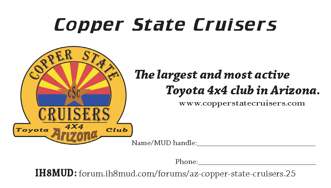
As discussed at the monthly meet last week, we're working on getting CSC business cards printed for recruiting purposes. I've made up a draft card design, please see below:

tWOXSW1.png


Opinions? The "slogan" line was just a sentence pulled off the website---if anyone has any other ideas for that, feel free to share. Also, @medtro has suggested adding a dynamic QR code that would link to the website or the CSC forum page; personally, I never bother to scan QR codes, but do other people? Need more data. If this would be useful, I'll redesign to include space for one, or see if printing options would allow for a QR code on the back.
 
I like it. A couple of thoughts:

1. Separate the Name and MUD name onto two different lines.
2. For the IH8MUD link, you can use a tinyurl AZ- Copper State Cruisers
3. What about adding a HAM call sign line?

Thank you Abigail.
 
Looks good.

What about email vs phone number? Or both.
 
I like it. A couple of thoughts:

1. Separate the Name and MUD name onto two different lines.
2. For the IH8MUD link, you can use a tinyurl AZ- Copper State Cruisers
3. What about adding a HAM call sign line?

Thank you Abigail.

On point three the ham community is still quite small. I don't think it would be pertinent. Points one and two are excellent.
 
Thanks all for the input. See below for version 2.0; tried to include a bit from everyone's suggestions [unsure why the "back" image looks so grainy hosted on imgur, tried uploading it twice, it looks normal in the original .png].

Front:
t7Xexbz.png


Back:
K8sD8aT.png


Print preview:
4euf47f.png
 
Ah wait, I couldn't leave it alone... What do you think, spaces or no spaces in the Copper State Cruisers title on the front? No spaces looks more vintage Land Cruiser imo, but :meh:

NOTuUCK.png
 
Looks great to me! Nice job Abigail :clap:

Edit: I like the spaces.
 
Looks Great,

Spaces!
 
I like it best with the spaces.

Nice job Abigail.
 
OK I'm gonna go ahead and call it--- spaces it is. Probably shouldn't have opened that :worms: in the first place.

We'll get these printed up before the next monthly meeting. Thanks all for your comments, guys!:cheers:
 
Solid work!
 
Looks great, thanks for tackling this.
 

Users who are viewing this thread

Back
Top Bottom