

-
North American Clubhouses - East RegionCA.ON- SOTEC CA.ON- Upper Canada Land Cruisers CA.QC- Club TORQ CA.QC- Quebec Cruisers AL- DixieLand Cruisers AL- Hot South Cruisers FL- Florida Land Cruiser Association FL- Northwest Florida Toyota 4WD FL- Tampa Bay Land Cruiser Association GA- Pavement Pounders GA- Georgia Cruisers GA/FL/AL- Red Hills Land Cruiser Club GA- YOTA IL- Windy City Land Cruisers IN- Hoosier Cruisers IN- Indiana Land Cruisers KY- Kentucky Landcruiser MA/NH- Yankee Toys MI- Lake Michigan Land Cruisers MS- CottonLand Cruisers NC- Olde North State Cruisers NJ- Garden State Land Cruisers NY/CT/MA- FJNortheasters NY- Gotham City Land Cruisers OH- The Buckeye Birfield Syndicate PA- Keystone Cruisers PA- Steel City Land Cruiser Club SC: Land Cruisers: Charleston SC- Palmetto State Land Cruiser Association SC- Upstate Cruisers SC- Swamp Fox Land Cruisers SC- Low Country Land Cruisers TN- Appalachia Cruisers TN- Bluff City Cruisers TN- STLCA VA- Bay to Blue Ridge Cruisers VA- COVA CRUISERS VA/DC/MD- Capital Land Cruiser Club VA/NC- Mid-Atlantic TLCA VA- Star City Land Cruisers VT/NH/MA/ME Acadian Overlanders WI- Land Cruiser Legends WV- Mountaineer Cruisers
-
North American Clubhouses - Central RegionCA.AB- Oil Country Cruisers CA.AB- Rocky Mountain Land Cruiser Association CA.AB- Toyota Ghost Wheelers AR- Razorback Land Cruisers AR/MO- Ozark Mountain Cruisers CO- BookCliff Cruisers CO- Colorado Land Cruisers CO- Derailed Cruisers CO- Rising Sun 4WD Club CO/WY- Horsetooth 4 Wheelers Cruiser Club IA- Tall Corn Cruisers KS/MO- Tornado Alley Cruisers LA- Bayou State Land Cruisers LA- Louisiana Land Krewesers MO- Gateway Cruisers MT- 406 Cruisers MT- Big Sky Cruisers NE- Flat Land Cruisers NM- High Desert Cruisers OK- Green Country Cruisers SD- Dakota Territory Cruisers TX- Alamo City Land Cruisers TX- Bayou City Land Cruisers TX- Lone Star Land Cruisers TX- Lone Star Land Cruisers - Austin Chapter TX- The White Trash of the Elwood Chapter TX- Toyota Trail Riders
-
North American Clubhouses - West RegionCA.BC- Coastal Cruisers CA.BC- Okanagan-Similkameen Land Cruisers CA.BC- Peace Canyon Toyota Swamp Donkeys CA.BC- Calgary Chapter: Swamp Donkeys
CA.BC- Vancouver Island Cruisers AZ- Copper State Cruisers CA- Beach-n-Toys CA- Central Coast Land Cruisers CA- Central Valley Crawlers CA- Gold Country Cruisers CA- Inland Empire Cruisers CA- L.A. County Trailcrew CA- Mountain Transit Authority CA- Pacific Mountain Cruisers CA- San Diego Cruisers CA - Santa Cruz Land Cruisers CA- SoCal 80's CA- Southern California Land Cruisers CA- Toyotally Awesome Cruisers HI- Hawaiian Island Land Cruisers ID- Treasure Valley Land Cruisers NV- Battle Born Cruisers of Northern Nevada NV- Southern Nevada Land Cruisers OR/CA- Jefferson State Cruisers OR- Cascade Cruisers OR- Central Oregon Cruisers OR- Portland Metro Cruisers UT- Red Rock Cruiser Club UT- Wasatch Cruisers WA- Central Washington Cruisers WA- North Sound Cruisers WA- South Sound Cruisers WA- Spokane Land Cruisers
Navigation
Install the app
How to install the app on iOS
Follow along with the video below to see how to install our site as a web app on your home screen.
Note: This feature may not be available in some browsers.
More options
Style variation
You are using an out of date browser. It may not display this or other websites correctly.
You should upgrade or use an alternative browser.
You should upgrade or use an alternative browser.
SoCal 80's Logo & T-Shirts
- Thread starter Slomo
- Start date
This site may earn a commission from merchant affiliate
links, including eBay, Amazon, Skimlinks, and others.


- Thread starter
- #82
OLDGOAT said:Either way is cool with me. I'm actually kind of interested to see what FirstToy would come up with, him being a cruiser fan and all. Might see an angle that we never thought of.
Good point. I will call Brent and see about him pitching our idea to FristToy and see what he comes up with.
Slomo said:Medium is actually more of what I was thinking, see post #19 and the shirt that Brent is wearing. Sheesh! First day with SoCal 80's and you already beat me to what I wanted to say in the first place.

The only shirt I saw in #19 was in Brent's avatar. I don't do horizontal stripes -- they make my butt look big!
 By the way, I'm sure I only beat you to it because you were probably involved in loftier matters that will preserve civilization, as we know it.
 Seriously, we probably want to consider two issues re: color: 1) A color we all like, or could at least tolerate. For me, that's almost any color. 2) How will the color of the shirt look with the color(s) in the logo? If we use warm colors in the logo (tan, orange, etc...), then we might not want to use a cool color (blue, gray, etc...) on the shirt. Someone with more experience in this area could probably lend valuable guidance.
Brown isn't generally one of my favorite colors, but being a warm color it might work well with the last proposed logo colors. And, it is pretty "dirt-friendly". The last time I was shopping with my kids (surf/skate stores), there were a lot of brown t-shirts indicating it's a currently popular color. And, of course, black works with anything, but it does tend to get hot...
Anyway, as I said earlier, count me in for at least 1 XL, regardless of the color and design. Maybe more for me and my family, if they look really cool.
- Thread starter
- #84
DirtyRice Joe said:The only shirt I saw in #19 was in Brent's avatar. I don't do horizontal stripes -- they make my butt look big!
If you look again at post #19 in the Official Big Bear Pics thread that Newps posted both pictures are of Ray in his truck with Brent walking along side spotting. Don't worry I am pretty sure we won't go with verticle stripes.
DirtyRice Joe said:Seriously, we probably want to consider two issues re: color: 1) A color we all like, or could at least tolerate. For me, that's almost any color. 2) How will the color of the shirt look with the color(s) in the logo? If we use warm colors in the logo (tan, orange, etc...), then we might not want to use a cool color (blue, gray, etc...) on the shirt. Someone with more experience in this area could probably lend valuable guidance.
Brown isn't generally one of my favorite colors, but being a warm color it might work well with the last proposed logo colors. And, it is pretty "dirt-friendly". The last time I was shopping with my kids (surf/skate stores), there were a lot of brown t-shirts indicating it's a currently popular color. And, of course, black works with anything, but it does tend to get hot...
Anyway, as I said earlier, count me in for at least 1 XL, regardless of the color and design. Maybe more for me and my family, if they look really cool.
Wow are you and interior designer? I never even considered matching the color of the design with the color of the shirt. That is good information though. I personally don't want black as you said it gets too hot and we will likely be wearing these outside on trips and such. I will put you down for 1 XL for now.
Favorite so far is like the Surf N Turf previously posted by Bluto (Thanks) with SoCal 80's on top and In Search Of The Perfect Trail on the bottom. In between an image like the 40 but an 80, well set up with a couple of long boards on a safari rack on top. If we went with a format like that it would be 3 colors. We can change the orange and tan around if everybody wants to I think the black is a given as is. Following is a list of people who are in so lets hear some feed back from those who haven't spoken up yet or speak up if you are not in yet and want to be. Depending on where we have the shirts actually silk screened we might do best to make extras to sell later. I imagine it would be easier than trying to have multiple small batches made.
Updated Shirt Quantity/Size list:
Ray- 2 @2XL, 1 @ S adult, 3@ kids sizes
Mo- 2 @ LG, 1 @ M
Smit- 1 + 1 female cut
Dan- 2 XL, 1 female cut, 1 3t kids
Eduardo- 1
Brent- 2 L ?
Tare- 1
John- 2?
Bluto- 2 XL different colors, 1 small
Kevin- 2 @ 2XL
Joe- 1 @XL
FYI for everyone else Brent is kindly checking with FirstToy on the design aspect and will report back when he finds something out.
Slomo said:If you look again at post #19 in the Official Big Bear Pics thread that Newps posted both pictures are of Ray in his truck with Brent walking along side spotting.
Got it, I was looking at #19 in this thread. Thanks!
Wow are you and interior designer?
No, but my wife is actually a kitchen designer for a custom cabinet company. She's got fantastic design sense. Maybe some of it's finally starting to rub-off on me...
]
- Thread starter
- #86
DirtyRice Joe said:Slomo said:If you look again at post #19 in the Official Big Bear Pics thread that Newps posted both pictures are of Ray in his truck with Brent walking along side spotting.
Got it, I was looking at #19 in this thread. Thanks!
Wow are you and interior designer?
No, but my wife is actually a kitchen designer for a custom cabinet company. She's got fantastic design sense. Maybe some of it's finally starting to rub-off on me...
]
Man with all of that color talk you could give Candice Olsen a run for her money! Er, I mean a.....
Yeah, I am married too.
If you hit the quote tab at the bottom right of a post, it will save you some time. It took me a couple of months to figure that out.

Hey, I uh...well, I don't know if you guys have already committed to a person to design the logo. If you have, great, but if you haven't, would you mind if I took a crack at it?
You can always say no. I won't be offended.
I do a little photochoppin' here and there, and I think maybe I can do something with what it is you guys are looking for. This is some stuff I've played with...this stuff is actually closer to a year old and I've coem a long way since then. Not to mention that these are just examples of the stuff I was learning.
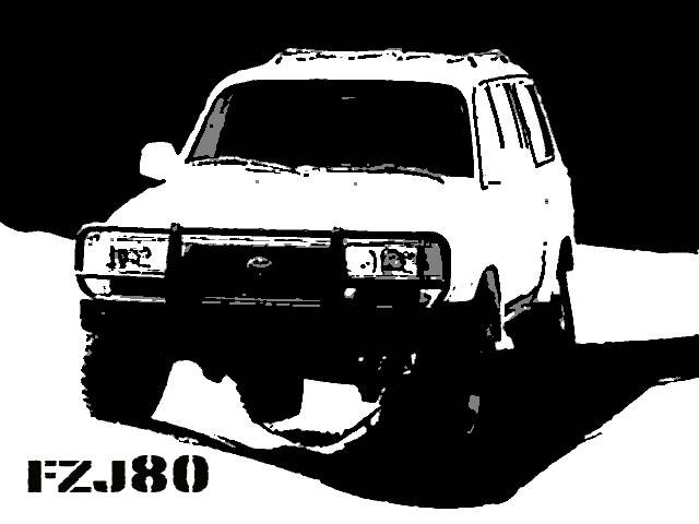
Simple three color stencil of an 80 (it took me like three minutes, and looks it)
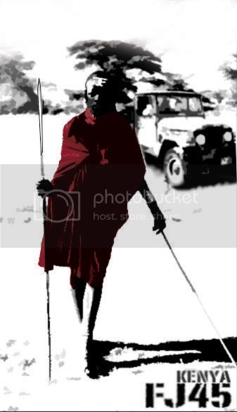
FJ45 Kenya: I took a picture of a 45 that I saw on Mud and put it with a stock photo of a Masai warrior in Kenya, flattened it, played with bleeding the lines, added a little color, and, well, it's not perfect, but like I said, I was learning.
I do a little bit of flattened/stencil stuff, it's kind of been an interest of mine. Here is some non-Cruiser stuff I've done...
Che Guevara (this is actually a physical stencil)
Hunter Thompson (also a physical stencil, Sharpie marker on manila envelope)
Gorilla Fighter (this is a photoshop that I made into a stencil)...you may recognize this from a t-shirt made by Fuct, as they seem to have *ahem* conveniently made a t-shirt (for the last five years) that looks exactly like my design, which I assure you is original (if only two years old). Somebody brought this to my attention recently. Do I think it's plagiarism? No. How could I? Unless they got a time machine (hmmmm). I never saw the original, or if I did, I don't remember. Weird-ass coincidence...in any case, I think mine's better.

All right, so now that that's out of the way, can I make your ******* t-shirt? I promise I'll do something FUN with it. If you don't like it, you don't have to use it!
Whatchoo got to lose?
You can always say no. I won't be offended.
I do a little photochoppin' here and there, and I think maybe I can do something with what it is you guys are looking for. This is some stuff I've played with...this stuff is actually closer to a year old and I've coem a long way since then. Not to mention that these are just examples of the stuff I was learning.
Simple three color stencil of an 80 (it took me like three minutes, and looks it)
FJ45 Kenya: I took a picture of a 45 that I saw on Mud and put it with a stock photo of a Masai warrior in Kenya, flattened it, played with bleeding the lines, added a little color, and, well, it's not perfect, but like I said, I was learning.
I do a little bit of flattened/stencil stuff, it's kind of been an interest of mine. Here is some non-Cruiser stuff I've done...
Che Guevara (this is actually a physical stencil)
Hunter Thompson (also a physical stencil, Sharpie marker on manila envelope)
Gorilla Fighter (this is a photoshop that I made into a stencil)...you may recognize this from a t-shirt made by Fuct, as they seem to have *ahem* conveniently made a t-shirt (for the last five years) that looks exactly like my design, which I assure you is original (if only two years old). Somebody brought this to my attention recently. Do I think it's plagiarism? No. How could I? Unless they got a time machine (hmmmm). I never saw the original, or if I did, I don't remember. Weird-ass coincidence...in any case, I think mine's better.
All right, so now that that's out of the way, can I make your ******* t-shirt? I promise I'll do something FUN with it. If you don't like it, you don't have to use it!
Whatchoo got to lose?

You are certainly welcome to take a crack at it. See the 'endless summer' post earlier in this thread. I think general consensus is to use that with surfboards on an 80 series cruiser, loose the people and put something like SoCal Cruisers up top and perhaps 'In Search of the Perfect Trail' below. I have contacted someone to give us some ideas, but you are welcome to join the fray.
Shahram, I'm always surprised when I find you out of "chat".
Sounds good to me, should be interesting to see what comes from that mind of yours. I like the fact that you own and wheel an 80, live in LA, and of course have artistic abilities. I look forward to seeing what you come up with.
Who knows, maybe you can convert us to Shahrislam.......hmm, come to think of it, I already follow most of the pillars Shahrislam!
And maybe we can get you to join us on an upcoming run. We'll call it a pilgrimage.
Sounds good to me, should be interesting to see what comes from that mind of yours. I like the fact that you own and wheel an 80, live in LA, and of course have artistic abilities. I look forward to seeing what you come up with.
Who knows, maybe you can convert us to Shahrislam.......hmm, come to think of it, I already follow most of the pillars Shahrislam!
And maybe we can get you to join us on an upcoming run. We'll call it a pilgrimage.
- Thread starter
- #90
Sounds good to me too. I look forward to the end result. I think it will be pretty cool to have our own logo. We are hitting the big time.

- Thread starter
- #92
I forgot. Shahram is it possible to clean up the lines of the first one to show a "little" more detail?
The first pic would be nice on the back of the shirt  .
.
I dont know about cleaning up the lines much. The more you clean that image the more youll see Shahrams face in the DS holding the steering wheel .
Im guessing its Shahs rig.
I think the second image is cool too - but the dude with the spear doesnt really apply to SoCal (unless we plan on taking the 80s to the Motherland. )
.I dont know about cleaning up the lines much. The more you clean that image the more youll see Shahrams face in the DS holding the steering wheel
.Im guessing its Shahs rig.
I think the second image is cool too - but the dude with the spear doesnt really apply to SoCal (unless we plan on taking the 80s to the Motherland.
)All right...
Yeah, I can clean up that first pic to show more detail. I have the original, as it's my rig.
Here's what I've come up with so far. Going off your "Endless Summer" idea, which, I have to admit is a special piece of graphic art to me. I had the poster up in my room as a kid for many years. That is probably my favorite movie, and I've seen it about three hundred times. Anyway, here's what I came up with so far:

I'm not crazy about the font...now that I'm really looking at it online, there's a few things that aren't quite right...okay work in progress.
Any suggestions?
Yeah, I can clean up that first pic to show more detail. I have the original, as it's my rig.
Here's what I've come up with so far. Going off your "Endless Summer" idea, which, I have to admit is a special piece of graphic art to me. I had the poster up in my room as a kid for many years. That is probably my favorite movie, and I've seen it about three hundred times. Anyway, here's what I came up with so far:
I'm not crazy about the font...now that I'm really looking at it online, there's a few things that aren't quite right...okay work in progress.
Any suggestions?
In no certain order:
agree with you on the font. Font like Woody's IH8MUD he uses to 'stamp' posted pics? This is where we've all met.
surf boards on a roof rack?
get an 80 with expedition front (arb) and rear bumper, not a stock bumper and sliders.
possible wave/ocean for the horizon?
I'd stick with the exact wording from the original poster - In Search of the Perfect Trail.
I liked the beige/orange color combo of Surf n Turf's endless summer.
agree with you on the font. Font like Woody's IH8MUD he uses to 'stamp' posted pics? This is where we've all met.
surf boards on a roof rack?
get an 80 with expedition front (arb) and rear bumper, not a stock bumper and sliders.
possible wave/ocean for the horizon?
I'd stick with the exact wording from the original poster - In Search of the Perfect Trail.
I liked the beige/orange color combo of Surf n Turf's endless summer.
Last edited:

Brentbba said:In no certain order:
agree with you on the font. Font like Woody's IH8MUD he uses to 'stamp' posted pics? This is where we've all met.
surf boards on a roof rack?
get an 80 with expedition front (arb) and rear bumper, not a stock bumper and sliders.
possible wave/ocean for the horizon?
I'd stick with the exact wording from the original poster - In Search of the Perfect Trail.
I liked the beige/orange color combo of Surf n Turf's endless summer.
Funny you should mention that font...that was the original font that I used and it looked a lot better, but I second-guessed myself and changed it.
Colors: no problem Beige/orange...yeah that sounds good.
Bumpers/roof rack/surfboard: I'll have to find a good, high-contrast 1/2 side-view profile of an 80 with that equipment. I could do my own, since it's ARB'd in front and Kaymar'd in back. I have an 11' longboard that would go well on top and actually show up in the pic...I'll have to draw in an expedition roof rack, which shouldn't be too hard. Sliders won't show up in the pic, unless you're doing something a lot more detailed...or willing to draw a hig-contrast version, which is out of my capability.
Wave/Ocean in the background: Hmmmm...that's a little more complicated. The flattened "horizon" of the original poster creates a horizon for the purposes of the viewer. The artist only has to reconcile two horizontal perspectives: the foreground and the background. Add waves in the background as a third layer, and you run the risk of looking too cut and pasted. A third perspective could throw the whole thing off. I will try though...it sounds good in theory.
Gimme a couple of days on this, and I'll see what I can pull off. In the meantime, I'd like to try a couple of different things. I'll submit them as they're made.
Holy s***, I just got a good idea...I'll get back to you by tomorrow.
I see what you mean re the horizon.
I too have your same set up and can borrow a surfboard or two. I don't have a roof rack right now either.
I could certainly get to a beach and snap some photos tho. We could even wait until SnT this year and get some great beach shots.
I too have your same set up and can borrow a surfboard or two. I don't have a roof rack right now either.
I could certainly get to a beach and snap some photos tho. We could even wait until SnT this year and get some great beach shots.

You an english major or engineer? hehehe
This is a rough draft. We'll run it by the english major's later.
Seriously, we could and perhaps should just say SoCal Cruisers since we've got more than 80 series folks.
What say you all?
This is a rough draft. We'll run it by the english major's later.
Seriously, we could and perhaps should just say SoCal Cruisers since we've got more than 80 series folks.
What say you all?
e9999 said:should it be 80s rather than 80's?